Certainly one of the most hard-working rooms of our home is the kitchen. By virtue of all that takes place, and the amount of time that most families spend in their kitchen, it truly is very important to create a pleasantly designed environment there.
But for all the time we might spend in this heart of the home, and all the importance we might place on making it pleasant, most kitchens present some interesting design challenges. This week's featured room makeover is a prime example.
Our homeowner was faced with the challenge of a kitchen area which was part of a generously sized great room, but in and of itself was really quite small and previously not very well defined. In addition, harsh architectural lines made everything feel a bit too angular, and there was no real focus to the room.
As with any design project, we began by identifying how the client needed this space to function. Aside from the obvious food preparation and storage needs, the family really wanted casual dining space, but their table and chairs seemed overwhelming in the rather small bay area beyond the kitchen's work triangle.
Although the great room as a whole is quite large, the kitchen area just felt sort of 'squished' to one end of it. We needed to better define the kitchen space, while also creating more of a sense of flow and unity to the rest of the great room. And, we needed to make it feel a whole lot more bright and cheerful.
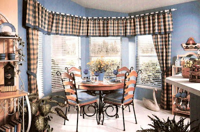
Without doing anything at all structurally, this room now looks like an entirely new space. The real secrets to making it all work better are the use of properly-scaled furnishings, color, pattern and texture, and the all-important addition of visual softness to the room.
Where colors were all neutral before, a vibrant cornflower blue has been used on the walls. Completing the color scheme with a sunny yellow, now upon entering the room the clients say they experience feelings of both cheerfulness and calm; very pleasing!
Marrying our two colors together and providing the pattern in the room is a bold buffalo check fabric, which is at once classic and casual. This fabric was used to create a tab top valance with cute button embellishments and bottom banding, mounted upon crisp white decorative rods which follow the shape of the bay. To create further softness and vertical eye movement, stationary side panels with coordinating tie-backs were the perfect choice.
When deciding how to dress the windows, we had to face the challenge of the disparity between the upward angle of the vaulted ceiling, the bow of the walls here, and the straight horizontal line created by the tops of the windows.
We chose to follow that horizontal direction with a straight topped treatment, to accent the bow by our choice of the mitered white rod, and then to play up the angled ceiling separately, by use of the bold blue wall color. In so doing, we've accomplished many things: bringing color, pattern and cheer into the space, adding softness, and visually defining the kitchen and eating areas.
To achieve a sense of flow, now, it was important to carry one of our kitchen colors into the rest of the great room. Sherwin Williams' "Bee" color was the perfect way to do that.
Furnishings were the next important step, and two new pieces provided just the right touch. A petite iron and wood bistro table and chairs provides for dining, while still keeping the space from feeling too crowded and closed in.
Its European Country styling is repeated in a complimentary bakers rack, which repeats the wood tones but picks up our crisp white accent color. The placement of the bakers rack, just around the corner from the bay, draws our eye into the rest of the great room and creates a real feeling of continuity.
Now, instead of feeling "cramped, blah and dreary" in their kitchen, our clients tell us it brings a smile every time they walk in.
Wednesday, August 4, 2010
A Casual Dining Area is the Perfect Fit
Labels:
design challenges,
fabrics,
furniture,
kitchens,
paint,
techniques,
window coverings
Subscribe to:
Post Comments (Atom)


No comments:
Post a Comment